
Compose Canvas API
Unleashing Creativity: Exploring the Power of Jetpack Compose Canvas API

Passionate software engineer skilled in Kotlin, Android, and Ruby, with a focus on creating robust and scalable applications. Proficient in full-stack development, I excel in architecting, developing, and deploying complex software systems that deliver seamless user experiences. With expertise in Kotlin, I have successfully developed and maintained Android applications, leveraging modern frameworks and libraries to ensure high-quality software solutions. Additionally, my proficiency in Ruby enables me to build efficient web applications and contribute to the development of dynamic and interactive websites.
Jetpack Compose has continued to evolve in its set of APIs that offers developers a comprehensive suite of tools that can be used to create rich user experiences. The Canvas API from Jetpack Compose lets us fine-tune the items we want to draw on the screen. This can include drawing individual lines, big rectangles, or even arcs. This article will discuss a variety of methods that Compose Canvas offers us and how we can use them to build custom UI elements.
Drawing UI
The easiest way to get started with drawing custom Compose components is by accessing the DrawScope interface. This can be accessed from various Modifier functions; Modifier.drawWithContent, Modifier.drawBehind, and Modifier.drawWithCache.
If you are interested in simply creating a custom UI then you can simply invoke the Canvas composable. This composable will have all its contents in a DrawScope. Some of the methods used to draw custom UI available to the Canvas API include:
drawWithContent- Creates aDrawModifierthat allows the developer to draw before or after the layout's contents. It also allows the modifier to adjust the layout's canvas.drawBehind- Draw onto aCanvasbehind the modified content.drawWithCache- Draw into aDrawScopewith content that is persisted across draw calls as long as the size of the drawing area is the same or any state objects that are read have not changed.
DrawModifier- AModifier.Elementthat draws into the space of the layout.
Drawer Methods
Here is a list of available methods that can be used to create and customize graphics on the Compose Canvas:
drawRoundRect() — Draws a rounded rectangle with the provided size, offset, and radii for the x and y axis respectively.
drawCircle() — Draws a circle at the provided center coordinate and radius. If no center point is provided the center of the bounds is used.
drawPath() — Draws the given Path with the given Color. Whether this shape is filled or stroked (or both) is controlled by DrawStyle.
drawIntoCanvas() — Provides access to draw directly with the underlying Canvas. This is helpful for situations to reuse alternative drawing logic in combination with DrawScope.
cubicTo() — Adds a cubic bezier segment that curves from the current point to the given point (x3, y3), using the control points (x1, y1) and (x2, y2).
quadraticBezierTo() — Adds a quadratic bezier segment that curves from the current point to the given point (x2, y2), using the control point (x1, y1).
lineTo() — Adds a straight line segment from the current point to the given point.
drawLine() — Draws a line between the given points using the given paint.
clipPath() — Reduces the clip region to the intersection of the current clip and the given path. This method provides a callback to issue drawing commands within the region defined by the clipped path.
drawRect() — Draws a rectangle with the given offset and size. If no offset from the top left is provided, it is drawn starting from the origin of the current translation.
drawArc() — Draw an arc scaled to fit inside the given rectangle. It starts from startAngle degrees around the oval up to startAngle + sweepAngle degrees around the oval, with zero degrees being the point on the right hand side of the oval that crosses the horizontal line that intersects the center of the rectangle and with positive angles going clockwise around the oval.
drawText() — Draw the specified range of text, specified by start/end, with its origin at (x,y), in the specified Paint.
drawOval() — Draws an oval with the given offset and size. If no offset from the top left is provided, it is drawn starting from the origin of the current translation.
rotate() — Add a rotation (in degrees clockwise) to the current transform at the given pivot point. The pivot coordinate remains unchanged by the rotation transformation.
The Compose Canvas is very verbose and includes other methods that can be utilized, these are just a few that we have discussed.
Marching onto the Canvas
To get started with the Canvas from Compose, we can try and create a green box.
@Composable
fun GreenBox(){
    Canvas(modifier = Modifier.size(200.dp)){
        drawRect(color = Color.Green, size = Size(170f, 190f))
    }
}
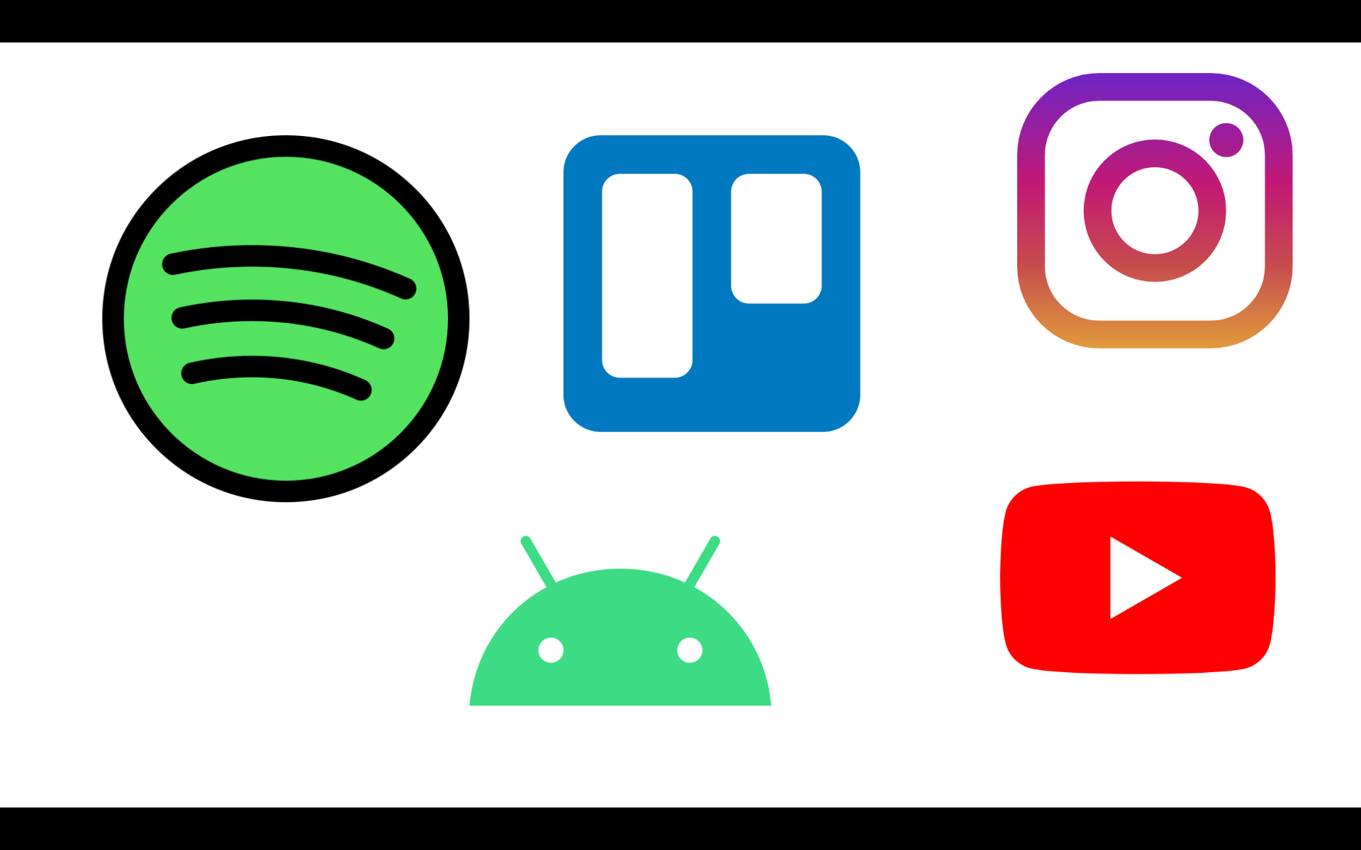
To explore more options in the Canvas API, we will try and recreate some of our favorite app icons. These include; YouTube, Spotify, Trello, Instagram, and Android.
YouTube
Let us get started with the YouTube logo.
@Composable
fun YouTube() {
    Canvas(
        modifier = Modifier
            .size(200.dp)
            .padding(8.dp)){

        // retrieve canvas size properties
        val height = size.height
        val width = size.width

        // draw red rectangular frame for the red YouTube outline
        drawRoundRect(
            color = Color.Red,
            cornerRadius = CornerRadius(x = 65f, y = 65f),
            size = Size(width, height * .65f),
        )

        // draw triangular path with white color
        drawPath(color = Color.White, path = Path().apply {
            moveTo(width * .35f, height * .18f)
            lineTo(width * .75f, height * .31f)
            lineTo(width * .35f, height * .48f)
            close()
        })
    }
}
This shape utilizes the drawRoundRect and drawPath methods to fully reproduce the YouTube logo as shown below.

Trello
We move on to Trello. This can be reproduced relatively easily as well. This is due to the nature of the shapes that make up the Trello logo.
@Composable
fun Trello() {
    Canvas(modifier = Modifier.size(200.dp)){

        val height = size.height
        val width = size.width

        // larger blue rectangle
        drawRoundRect(
            color = Color.Blue,
            cornerRadius = CornerRadius(35f, 35f)
        )

        // first white slab
        drawRoundRect(
            color = Color.White,
            cornerRadius = CornerRadius(15f, 15f),
            size = Size(width * .3f, height * .6f),
            topLeft = Offset(width * .15f, height * .15f)
        )

        // second white slab
        drawRoundRect(
            color = Color.White,
            cornerRadius = CornerRadius(15f, 15f),
            size = Size(width * .3f, height * .45f),
            topLeft = Offset(width * .55f, height * .15f)
        )

    }
}
This shape only uses the drawRoundRect method to recreate the three shapes.

Time to start looking at shapes that are a little more complex. We will start with the Instagram icon.
@Composable
fun Instagram() {
    val logoColors = listOf(Color(0xFF673AB7), Color(0xFFF44336), Color(0xFFFF9800))
    Canvas(
        modifier = Modifier
            .size(200.dp)
            .padding(8.dp)){

        val height = size.height
        val width = size.width

        // draw a rectangle with only the border
        drawRoundRect(
            brush = Brush.linearGradient(logoColors),
            cornerRadius = CornerRadius(85f, 85f),
            style = Stroke(width = 35f, cap = StrokeCap.Round)
        )

        // draw inner middle circle
        drawCircle(
            brush = Brush.linearGradient(logoColors),
            radius = 105f,
            style = Stroke(width = 55f, cap = StrokeCap.Round)
        )

        // draw smaller circle at the top right
        drawCircle(
            brush = Brush.linearGradient(logoColors),
            radius = 25f,
            center = Offset(x = width * 0.8f, y = height * .15f)
        )

    }
}
This shape combines the use of the drawCircle and drawRoundeRect methods. We also used the brush property for the first time to provide gradient borders.
Droid Icon
Time to try the Android Icon. This will allow us to combine several drawing methods that we have not tried in any of the other icons above.
@Composable
fun DroidIcon() {

    Canvas(
        modifier = Modifier
            .size(200.dp)
            .padding(8.dp)){

        val height = size.height
        val width = size.width

        // draw base arc
        drawArc(
            color = Color(0xFF4CAF50),
            useCenter = true,
            startAngle = 0f,
            sweepAngle = -180f,
            topLeft = Offset(x = width * .2f, y = height * .75f),
            size = Size(width = width *.6f, height = height * .5f)
        )

        // draw left antennae
        drawLine(
            color = Color(0xFF4CAF50),
            start = Offset(x = width * .15f, y = height * .75f),
            end = Offset(x = width * .25f, y = height * .85f),
            strokeWidth = 15f,
            cap = StrokeCap.Round
        )

        // draw right antennae
        drawLine(
            color = Color(0xFF4CAF50),
            start = Offset(x = width * .85f, y = height * .75f),
            end = Offset(x = width * .75f, y = height * .85f),
            strokeWidth = 15f,
            cap = StrokeCap.Round
        )

        // draw left eye
        drawCircle(
            radius = width.times(.04f),
            color = Color.White,
            center = Offset(width.times(.38f), height.times(.88f))
        )

        // draw right eye
        drawCircle(
            radius = width.times(.04f),
            color = Color.White,
            center = Offset(width.times(.62f), height.times(.88f)),
        )
    }

}
Here, we now get to work with some new methods such as drawLine, drawCircle and drawArc.

Spotify
We have saved the best for last. This logo has a set of curvatures within the logo that will require some bit of Mathematical knowledge. We will not discuss the theoretical knowledge behind it in this article, however, it can prove very useful if you had a basic understanding of Beizer Curves.
@Composable
fun Spotify() {

    Canvas(
        modifier = Modifier
            .size(200.dp)
            .padding(8.dp)) {

        val height = size.height
        val width = size.width

        // draw green background
        drawCircle(
            color = Color(0xFF1ed760)
        )

        // draw black borderline
        drawCircle(
            color = Color.Black,
            style = Stroke(width = 25f)
        )

        // draw the three independent lines using Bezier Curves
        drawPath(
            color = Color.Black,
            style = Stroke(width = 18f, cap = StrokeCap.Round),
            path = Path().apply {
                // starting point
                moveTo(
                    x = width * .18f,
                    y = height * .35f
                )

                cubicTo(
                    width.times(.17f),
                    height.times(.35f),
                    width.times(.46f),
                    height.times(.21f),
                    width.times(.81f),
                    height.times(.38f)
                )

                // reset path painter for second line
                moveTo(
                    width.times(.28f),
                    height.times(.50f),
                )

                cubicTo(
                    width.times(.27f),
                    height.times(.50f),
                    width.times(.45f),
                    height.times(.43f),
                    width.times(.73f),
                    height.times(.55f)
                )

                // reset path painter for third line
                moveTo(
                    width.times(.33f),
                    height.times(.67f),
                )

                cubicTo(
                    width.times(.33f),
                    height.times(.67f),
                    width.times(.45f),
                    height.times(.62f),
                    width.times(.67f),
                    height.times(.72f)
                )
            }
        )
    }

}
This shape is a little bit complex to create, however, a little practice on how Beizer Curves work will make this a piece of cake.

Conclusion
Jetpack Compose, Google's innovative UI toolkit, has gained widespread recognition for its declarative approach and streamlined development experience. A standout feature within Compose is the Canvas API, which provides developers with a powerful toolset to create custom graphics and animations effortlessly. With an intuitive syntax and seamless integration, the Canvas API enables developers to unleash their creativity and enhance user experiences by designing visually stunning and interactive elements.
The Canvas API in Jetpack Compose serves as a versatile drawing surface, allowing developers to render complex visual elements and perform various graphical operations. Through this API, developers can easily draw shapes, lines, and text, apply transformations, gradients, and blending modes, and handle touch events for intuitive user interactions. Moreover, the Canvas API seamlessly integrates with other UI components in the Jetpack Compose framework, enabling the creation of dynamic and responsive designs that captivate users.
Beyond static graphics, the Canvas API in Jetpack Compose offers robust animation capabilities. Developers can leverage the animate() and animateTo() functions to create smooth and engaging transitions, enabling fluid motion effects, interactive gestures, and playful interactions. With the Canvas API's support for complex gestures like pinch-to-zoom or swipe-to-dismiss, developers can implement intuitive and interactive controls effortlessly. Additionally, the Canvas API is designed for optimal performance, leveraging hardware acceleration and rendering optimizations, ensuring that even graphically intensive applications run smoothly on a variety of devices.
You can explore more about the Jetpack Compose Canvas on the main documentation page here.


